Visualizing Movie Credits
 In a fascinating presentation at Eyeo Festival 2011, Amanda Cox, the graphics editor at the New York Times, showed among other things a visualization they made about movie credits getting ever longer. The article even coins the term “credit creep”.
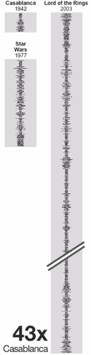
The layout of this blog cannot do this justice as it was meant to be set on the side of a printed page under the headline Who Was That Food Stylist? Film Credits Roll On, assumedly running over the full height. So the thumbnail on the left of this paragraph had to be cropped dramatically (click through to the original to get an idea of the proper proportions).
Sometimes a simple solution that doesn't even look like data visualization can be very effective. And especially with regard to showing extremes, the broadsheet format of the printed newspaper (vertical pages of 22 inches / 559 millimetres or more) can bring its strengths to the table.
Watch Amanda's presentation Shaping Data for News in full (46min), featuring examples from election results to baseball hitting techniques.
Labels: en, nyt, visualization