2004 bis 2014: Wir lesen das Internet in RSS Feedreadern
Anfang der 2000er Jahre war bloggen das große neue Ding im Internet. Wortfeld hat in seiner Erinnerung an Blogger.com über diese Zeit geschrieben, als noch nicht alles Google gehörte.
Damals war die einzige Möglichkeit, jemandem zu folgen, indem man den rss-Feed seines Blogs abonnierte. Vielleicht zeigt diese Formulierung, warum sich die Technik – in dieser Form – nicht durchgesetzt hat. Denn folgen tut man Menschen und es ist scheinbar einfacher, sich den Strom aller Pressemitteilungen (etwa der Stadtwerke München) als Menschen vorzustellen, statt sich die Lebensäußerungen eines Menschen als XML-Stream einzuverleiben.
In diesen Jahren konnte es der alleinige Grund sein, sich einen Mac zu kaufen, denn zum Lesen der rss-Feeds gab es zunächst nur eine wirklich gute Software, nämlich NetNewsWire.
NetNewsWire ist eines der ganz wenigen Programme, die mir nie abgestürzt sind, und ich habe viele Stunden am Tag darin verbracht. Aber in den letzten Jahren immer weniger. Schuld daran ist auch, dass seit dem Tod von Google Reader NetNewsWire nicht mehr über alle Geräte synchronisiert. Und Programme, die das nicht tun, sind in der heutigen multi-device Welt einfach nutzlos. Die Älteren unter uns, die noch E-Mail lesen, mögen auf all ihren Geräten noch einmal POP statt IMAP verwenden und werden das keine 24 Stunden überleben. Es ist fraglich, ob NetNewsWire 4 jemals das beta Stadium verlässt und einen eigenen Sync-Dienst bekommt. 2015 könnte das Jahr werden, in dem ich das Programm überhaupt nicht mehr gestartet haben werde.
Heute kann man mit Twitter fast alles erledigen, was früher im RSS Reader stattfand, mal abgesehen davon, dass zum Bloggen sowieso niemand mehr Zeit hat. Feedreader leben als Podcast Clients weiter, für deren Bedienung man die Buchstaben rss nicht aussprechen muss. Podcasts funktionieren einfach, weil jedes Programm seinen eigenen Katalog mitbringt, aus dem man sich sein Programm (im Sinne von Sendung) auswählt.
Um den Kreis der Nostalgie zu schließen, blogge ich diese Erinnerung mit einer lokalen Installation der Software Movable Type 4.3, die daraus einen RSS 2.0 und einen Atom-Feed generieren wird. Seit einigen Jahren braucht man eine Browsererweiterung, um das als Leser überhaupt zu merken. Zur Sicherheit gucke ich gleich mal in NetNewsWire nach, ob der Feed auch wirklich funktioniert (das Programm wartet immer noch auf eine neue Folge 137).
Die Diagramm-Werkzeuge von Illustrator oder Excel haben sich im Vergleich zum Rest der Programme erstaunlich wenig weiterentwickelt. Auch im Jahre 2013 ist es mit Excel nicht ohne weiteres möglich, einen Scatterplot mit Labeln zu versehen. Die offizielle Hilfeseite sagt dazu:
In Microsoft Excel gibt es keinen integrierten Befehl, der in einem XY-Punktdiagramm oder einem Blasendiagramm automatisch Datenpunkte mit Beschriftungen versieht. Sie können jedoch ein VBA-Makro für diese Funktion erstellen.
Dies fällt umso stärker auf wenn man sieht, wie vielfältig Datenvisualisierung im Web heutzutage daherkommt. Es wäre ein Leichtes, dies den Herstellern anzulasten, aber bei genauerer Betrachtung zeigt sich, dass Visualisiserungen jenseits von Balken- und Tortendiagrammen zu vielfältig sind, als dass man sie mit einer einfachen graphischen Oberfläche konfigurieren oder erstellen könnte.
Auch in Excel steht man oft vor dem Problem, dass das Programm eine große Hife ist, wenn man das will, wass vom Programm vorgesehen ist, dass es aber haarig wird, wenn man vom vorgegebenen Pfad abweichen möchte. Das fängt schon bei der Bevölkerungspyramide an und hört bei thematischen Karten noch lange nicht auf.
Vor diesem Zwiespalt standen Programme schon immer, weshalb die mächtigeren unter ihnen über eine eigene Makro-Sprache verfügen, die dort weiterhelfen soll, wo die Standardfunktionen aufhören (s.o.).
Wenn man dies weiterdenkt, dann ergeben sich natürlich die größten Freiheiten, wenn man gleich zu einer Programmiersprache greift.
Und das ist auch genau der Ansatz der JavaScript Bibliothek D3, die einem all jene Funktionen zur Verfügung stellt, die datenbasierte Graphiken benötigen: Nämlich Zahlenwerte in graphische Attribute (Länge, Breite, Position, Farbe …) umsetzen und dazu viele Hilfestellungen bietet wie z.B. für die Beschriftung von Achsen, die oft mühsamer sind als das eigentliche Diagramm. Als Einstieg hier ein Scatterplot mit Labeln, realisiert mit D3.
Wenn man der These folgt, dass es einfacher ist, eine ausgefeilte Datenvisualisierung mit D3 im Webbrowser zu entwickeln als in Illustrator, dann stellt sich die Frage, wie man dann die gedruckten Medien bedienen kann.
In der Frühzeit des Webs wurden die Inhalte zunächst für Print gedacht und entwickelt und dann nach und nach so gut es ging an das Web angepasst. Jetzt ist es durchaus möglich und sogar empfehlenswert, im Web zu beginnen und die dort programmatisch erzeugten Datengraphiken in den Print-Workflow zu übernehmen.
Hier soll kurz gezeigt werden, wie das am besten geht. Bereits in meinem SVGopen Papier SVG Strengths for Web Mapping (pdf, 8.1MB) hatte ich 2009 als ersten Vorteil das Ausdrucken angeführt. Safari und Firefox waren zum damaligen Zeitpunkt bereits in der Lage, beim Ausdrucken von Webseiten mit SVG Inhalten in eine PDF-Datei die Vektorinformation beizubehalten, was eine Weiterberbeitung für Print-Workflows erlaubte, jedoch unter Verlust der semantischen Information (beispielsweise der Wahlkreisnummer eines Polygons in einer thematischen Karte).
In den letzten Jahren gab es weitere große Fortschritte auf Seite der Browser: War der Durchbruch des Webs und das gegenseitige Lernen durch die „View Source“ Möglichkeit bedingt, kam diese lange Zeit an die Grenzen bei dynamischen Inhalten. Die Funktion „Quelltext anzeigen“ erlaubte lediglich die Untersuchung der statischen Inhalte einer Webseite. Dagegen erlauben die Developer Tools moderner Browser heute die Analyse jedes beliebigen Zustands einer Webseite; das sogenannte live DOM wird zugänglich.
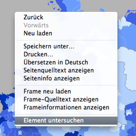
Am Beispiel der Karten auf wahlatlas.net soll das Vorgehen hier kurz erläutert werden. Dazu verwendet man entweder den Browser Google Chrome oder Apple’s Safari, wobei man bei letzterem zunächst in den Einstellungen unter „Erweitert“ das Entwickler-Menü aktivieren muss. Dann klickt man im Bereich der Karte, jedoch nicht in einen Wahlkreis, weil man die Element-Information für die gesamte Karte haben möchte.
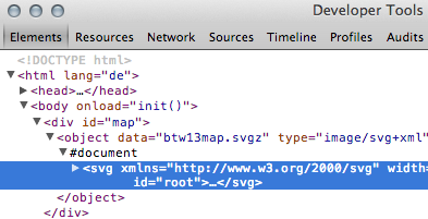
In diesem Kontext-Menü (Rechts- bzw. ctrl-Klick) gibt es den Eintrag Element untersuchen was einer erweiterten Anzeige des aktuellen „Quelltextes“ entspricht bzw. genauer gesagt den aktuellen Zustand des DOM zugänglich macht. Nachfolgende Abbildung zeigt vereinfacht, wie das aussieht. Der Clou liegt darin, dass man in diesem Quelltext – auch bei eingeklappten Elementen – Teile der Baumstruktur einfach markieren, kopieren und weiterverwenden kann:
Developer Tools: Live DOM
In einen Texteditor eingefügt und mit der Dateiendung .svg abgespeichert, lässt sich dies dann in Illustrator, Inkscape o.ä. verarbeiten. Ggf. kann es bei manchen Grafiken Probleme mit den Dimensionen geben. Im Wahlatlas etwa sieht das Viewbox-Attribut so aus:
D.h. die SVG-Grafik soll immer das sie umgebende DIV vollständig ausfüllen, weshalb die Abmessungen jeweils als 100% angegeben sind. Es empfiehlt sich hier gleich vor dem Abspeichern die Dimensionen eines A4 Blattes einzugeben:
width="21cm" height="29cm"
In vielen Fällen kann dieser Vorgang mit dem Bookmarklet SVG Crowbar noch weiter vereinfacht werden. Bislang lediglich für Google's Chrome besteht so die Möglichkeit, die Grafik direkt als weiterverarbeitbare SVG Datei herunterzuladen.
Für die Karte der Wahlkreise bleibt auf diese Weise die Metainformation der Wahlkreisnummer und ihres Namens im SVG Quellcode erhalten:
Dass eine Zeitung, deren Motto All the News That's Fit to Print ist, heute auf dem webbasierten Versionsverwaltungs-System GitHub zu finden ist und eben dort ein Bookmarklet zur Extraktion von SVG Graphiken aus Webanwendungen anbietet, zeigt einmal mehr, dass das Universalwerkzeug Browser heute sogar Teil der Druckvorstufe ist.
During the final SVGopen conference this September in Zürich, which also marked the first iteration of The Graphical Web, I spoke about SVG in eBooks. Intended as a solution for ever higher but varying pixel densities of eReaders and tablets, it turned out that the authoring side of things is lacking. Nevertheless the resolution independence of SVG can already be harnessed in eBooks today, some caveats notwithstanding.
The Swiss Federal Institute of Technology in Zürich, that hosted the conference, made recordings of all the talks available in various formats. Thus you can watch my presentation "SVG in eBooks" on almost any device.
The talk is based on a published paper with the full title SVG in eBooks – Packaging the Graphical Web for Offline Use and contains a lot of links to resources and example files. Also available from this site are the slides of the presentation as they were shown in the above recording.
Ten years of writing the Daring Fireball blog has drawn many ways of appreciation for John Gruber. Among them a wonderful visual analysis into the topics of his articles.
Discussion of this research on The Talk Show lead me to try some more on the data. It almost certainly asked to be looked at in a Calendar View using the d3.js library.
I leave it to the viewers to come to their own conclusions if and what (seasonal) patterns are revealed in that graphic. As became clear pretty soon, his work has expanded far beyond the written word in recent years. So the graphic was appended with links to the talks John gave. It has been a pleasure to listen and watch those great talks about design and excellence again.
And with this I present John Gruber’s Œuvre, a data visualisation of the first ten years of his articles with regard to word count by day. Thanks to Kemper Smith for letting me re-use the data he gathered.
Die Konferenz »The Graphical Web« (SVGopen) Zürich, 11. bis 14. September 2012
Seit 2003 habe ich in vielen Jahren die Konferenz SVGopen besucht und dabei die Entwicklung dieser für die Informationsgraphik im Web so wesentlichen Technologie verfolgt. Der Weg, den das offene Vektorgraphik-Format SVG genommen hat, war beschwerlich und es gab in den Jahren 2005 bis 2008, insbesondere nachdem Adobe mit der Firma Macromedia das Flash Format übernommen hatte, viele Zweifel an der Verbreitung des SVG Standards.
Und dann ging zum Schluss alles vergleichsweise schnell: Microsoft verkündete im März 2010 die Pläne für Internet Explorer 9 und dass dieser native SVG Unterstützung enthalten würde. Es war als hätten alle darauf gewartet, die anderen Browser – einschließlich Safari für iPhone und iPad – verstanden zu diesem Zeitpunkt SVG schon sehr gut. Umgekehrt waren es eben jene iOS Geräte von Apple, die niemals Flash Unterstützung erhielten und im Juni 2012 verkündete Adobe schließlich auch das Ende von Flash für Android. Damit ist SVG im stationären wie im mobilen Web etabliert und gliedert sich in die anderen modernen Webstandards ein.
So ist dann auch die diesjährige Ausgabe der SVGopen Konferenz die letzte und gleichzeitig die erste mit dem Titel The Graphical Web, um das Themenspektrum auf neue Entwicklungen im Bereich CSS, Canvas, WebGL und mehr zu erweitern. Das Wort plugin kommt dabei nicht mehr vor und eine Keynote wird sogar von dem berühmten Flash Designer Joshua Davis gehalten. Der neue Slogan der Konferenz zeigt eindeutig die allgemeinere Ausrichtung:
The Graphical Web is a conference for discussing what is aesthetically possible on the web.
Das genau war es auch, was der Konferenz mit SVG als einzigem Thema fehlte. Die Beschränkung auf die technischen Möglichkeiten des Formats zielte zu sehr auf Ingenieure und eventuell noch Kartographen ab, Gestalter waren oft unterrepräsentiert. Das neue Layout der Konferenz-Webseite und die Sponsoren Adobe, Google und Microsoft weisen den Weg in das moderne Web mit seinen umfangreichen ästhetischen Ausdrucksformen und Gestaltungsmitteln.
Konferenzsprache ist Englisch, aber die Veranstalung findet in einem übersichtlichen Rahmen statt und ist von familiärer Atmosphäre geprägt, sodass sich auch die Nicht-Muttersprachler sehr willkommen fühlen werden. Bis zum 13. August gibt es noch eine ermäßigte Teilnahmegebühr. In der umweltbewußten Schweiz gehört dazu auch ein ÖPNV Fahrschein für die gesamte Woche.
Mein Beitrag dieses Jahr behandelt SVG in eBooks. Dabei komme ich mir manchmal vor wie wenn man die Zurück auf Los Karte gezogen hat und in die Anfangszeit moderner Webtechnologien strafversetzt wird: Unterschiedliche (begrenzte) Implementierungen, das Henne und Ei Problem zwischen Inhalteanbietern und Implementationen von Lesesoftware u.v.a.m.
Einige Hinweise zur aktuellen kartographischen Darstellung im Wahlatlas. Zunächst in inhaltlicher Hinsicht: Es werden alle acht Parteien dargestellt, die bei der Landtagswahl 2009 mindestens 1% der gültigen Zweitstimmen erhielten. Die beim ersten Aufruf gezeigte Karte wird zufällig ausgewählt. Es können aber auch Darstellungen bestimmter Parteien direkt verlinkt werden, z.B.: CDU, SPD, SSW, Grüne, Piraten. Eine Interpretation der bei den einzelnen Parteien zu beobachtenden regionalen Muster versucht das folgende Video.
Unter technischen Gesichtspunkten habe ich in Bezug auf den SVG Einsatz in früherenEinträgen schon etwas aufgeschrieben. Trotz der vielen Inseln und des detaillierten Küstenverlaufs ist die Wahlkreisgeometrie lediglich 18 kB groß. Aus Gründen des Copyrights konnte das Shapefile von Statistik-Nord nicht verwendet werden, weshalb ich die Wahlkreisgrenzen mit Inkscape aus der von der Landeswahlleiterin veröffentlichten PDF Version extrahiert und für die Bildschirmdarstellung noch etwas weiter vereinfacht habe.
Zusätzlich kommen CSS3 Transitions zum Einsatz, etwa beim Übergang zur Widescreen Darstellung (Helgoland wird sichtbar) als auch beim Wechsel des Highlights in der Ergebnistabelle. Diese Technik ist so überzeugend, weil sie wirklich nur den experience layer betrifft oder etwas schnöder ausgedrückt die verzierenden Animationen. Unterstützt ein Browser diese Technik noch nicht, so ergeben sich keine funktionellen Einschränkungen, es sieht dann halt nur nicht so elegant aus.
Die Funktion zum Hineinzoomen und Verschieben der Karte mit der Maus wie bei Google Maps wurde weggelassen, da es bei nur 35 Wahlkreisen immer um den Überblick geht. Stattdessen ist das Layout so angelegt, dass die Minimalauflösung von 1024x768 (iPad, Standard Beamer) ein gut lesbares Ergebnis gibt, das auf 24" oder 27" Monitoren dann als Ganzes mit der Vergrößern-Funktion des Browsers (strg/cmd und +) angepasst werden kann. Ein gesondertes Layout für den Ausdruck ist entfallen. Die Legende ist in der Druckausgabe jetzt auch dann nutzbar, wenn keine Hintergrundfarben gedruckt werden (Voreinstellung der meisten Browser).
I wrote a similar blog post in english about Google Chrome Frame and legacy versions of Internet Explorer titled Better Browsers over on the blogstats weblog.
Glücklicherweise haben alle Webbrowser in den vergangenen Jahren große Fortschritte gemacht, was die Kompatibilität mit modernen Webstandards wie CSS und SVG angeht, und den Nutzern steht heute eine umfangreiche Auswahl an kostenfreien Produkten zur Verfügung. Mit dem Internet Explorer 9 ist auch Microsoft schließlich dieser Entwicklung gefolgt. Deshalb setzen die neuen Infografiken auf dieser Seite moderne Browser voraus und bieten keine Rückfalloption mehr an (siehe die Vorsätze für 2012).
Trotzdem kann man auf recht einfache Weise denjenigen helfen, die aus Gewohnheit oder mehr noch als Vorgabe ihrer IT-Abteilung standardmäßig Internet Explorer 6, 7 oder 8 verwenden (müssen): Google Chrome Frame ist ein plugin, welches die JavaScript und HTML rendering engine des Google Chrome Browsers innerhalb von Microsoft's Internet Explorer einsetzt. Das bedeutet, es bleiben alle Gewohnheiten („Internet ist für mich das blaue e“) und Einstellungen (vor allem Lesezeichen) bestehen. Ja es bleibt sogar standardmäßig auch das Internet Explorer eigene Verhalten in Bezug auf HTML, CSS und JavaScript bestehen, was für das Funktionieren von hausgemachten Intranetanwendungen zwingend sein kann. Lediglich Webseiten, die mit einer zusätzlichen Meta-Information ausgeliefert werden, werden innerhalb der Bedienoberfläche des Internet Explorers mit Google Chrome dargestellt.
Beim Wahlatlas zur Landtagswahl 2012 in Schleswig Holstein erscheint der hier abgebildete Hinweis für Nutzer älterer Versionen von Internet Explorer (Version 8 oder älter), die kein SVG darstellen können. Dies wird als alternativer Text des <object> tags realisiert, ohne jede weitere Prüfung auf den Hersteller des Browsers oder dessen Version. D.h. in den extrem seltenen Fällen, in denen Nutzer noch das SVG plugin von Adobe installiert haben, wird dieser Hinweis nicht sichtbar, die Darstellung funktioniert aber trotzdem nicht, da der Wahlatlas SVG und HTML in einer standardkonformen Weise mischt, wie sie von dem schon lange ausgemusterten SVG plugin nicht unterstützt wird.
Im obigen Beispiel führt der link zur Download-Seite von Google Chrome Frame, die nach einer Bestätigung und erfolgter Installation wieder automatisch auf die Ausgangsseite – hier den dann funktionierenden Wahlatlas – zurückleitet. Sollte auf dem Rechner bereits der Google Chrome Browser (unbekannterweise) vorhanden sein, werden große Teile dessen Programm-Codes genutzt und der Download beschränkt sich auf wenige Sekunden.
Google hat ein wirtschaftliches Interesse an einem schnellen Web und an Nutzern, die immer auf die neuesten Webtechnologien updaten. Daher aktualisiert sich Google Chrome in sehr kurzen Abständen selber und es wurden auch die Hürden für die Verwendung des Chrome Frame plugins immer weiter reduziert. Insbesondere werden jetzt keine Administrator Pivilegien mehr zur Installation benötigt. Auf der Hausmesse Google I/O 2011 wurden diese und andere Neuerungen detailliert erläutert (video).
Natürlich gibt es gute Gründe, den vermeintlich kostenlosen Produkten der Firma Google kritisch gegenüber zu stehen. Aber realistischerweise werden alle Datenschutz-sensibilisierten Menschen sowieso bereits einen anderen modernen Browser verwenden. Google Chrome Frame ist also lediglich ein interessanter Ansatz, die Ablösung älterer Versionen von Internet Explorer für diejenigen zu beschleunigen, die sich um so etwas nicht kümmern wollen. Dabei verlangt dieses Vorgehen keinerlei Kompromisse für die Entwicklung von Webseiten oder -anwendungen.